SENSEI ❖ Mobile Payments for Everyone
Aug 2011
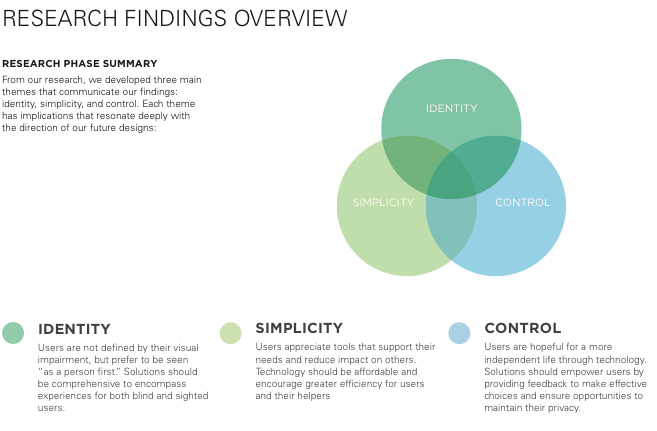
Executive Summary
This project served as the capstone for my HCI masters coursework at Carnegie Mellon. I was part of an interdisciplinary team, working together to better the quality of life for people who are blind or have low-vision. In conjunction with our client, Bank of America R&D, we engaged in a 7-month project focused on the check-out and payment processes. Our team was passionate about exploring the physical and non-visual design space as a way to create accessible solutions usable for everyone.
Key Problems
- Research participants struggled immensely with shopping experiences and payment solutions not designed for them
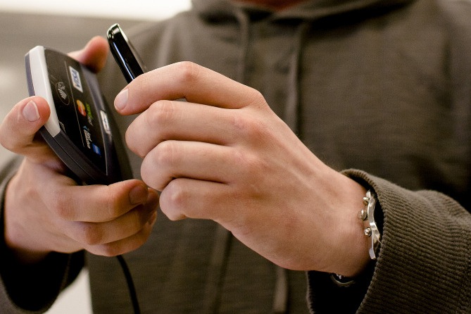
- Physical interactions of NFC payments were cumbersome, requiring extreme levels of physical precision; difficult for sighted users, virtually impossible for the blind.
- We found serious ethical concerns in lack of information transparency (both in physical environment and about the financial transaction)
- Pressure to finish quickly only makes interaction issues and emotional tensions worse
- Transaction systems must be built with accessibility in mind universally. Add-on technology to enable blind-friendly interactions do not feel inclusive (and are not a practical sell in the market).
- New technologies were critical in leveling the playing field between users of different abilities (specifically, accessibility features in the iPhone)
- We identified, prototyped and analyzed additional opportunities to improve the shopping experience beyond transaction experiences (e.g. directing users to objects in proximity, aiding indoor navigation and movement planning). However, developing a mobile payment solution remained the best fit for the client’s needs.
Solution Strategy
- Leverage the enhanced agency of users information environment through their personal device.
- Role-switch the need for consumer to ‘target’ the payment system and put the pressure on the cashier.
- Allow direct wireless connection between devices at the beginning of the transaction, rather create undue pressure than the end.
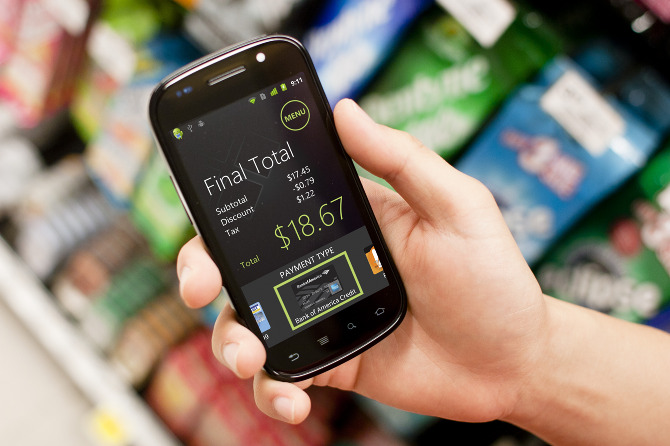
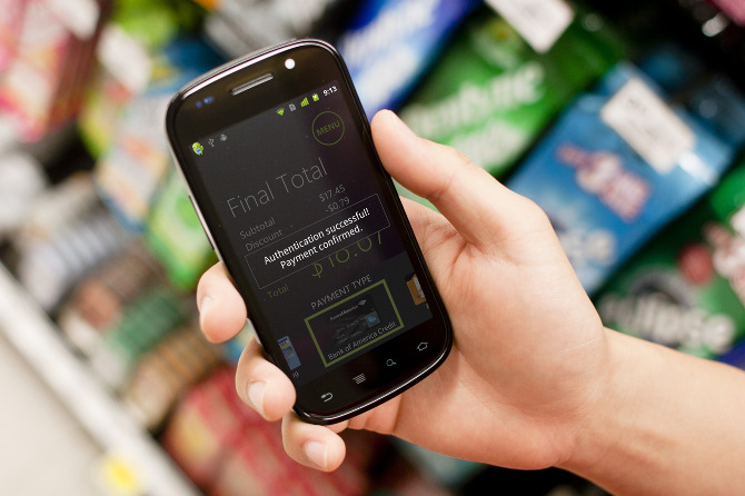
- Increase data transparency by beaming transaction details information back to the users device.
- Allow alternative authentication mechanisms to avoid the need for an inaccessible signature pad.
- Enable easy in-store upgrades with minimal hardware changes, ideally via a low-cost peripheral.
Due to patent application restrictions, explicit details about the final product are not available here. The design process and general description of the outcome are described below.
Full Project Report
Our Goal
to develop a universally accessible payment system that builds the confidence of visually impaired users
My roles as Design Lead
- Evaluated data and worked with teammates to optimize research opportunities
- Ensured universality of prototypes by coordinating decisions within the group
- Crafted (and re-crafted) wireframes and physical mockups for prototyping
- Guided the team through the synthesis process
- Presented research findings to client groups
- Communicated design specifics to software team
- Acted as lead writer and editor-in-chief for final research and design reports
Research
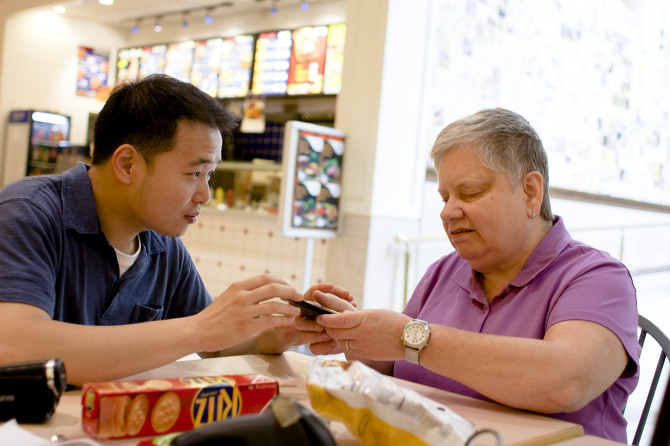
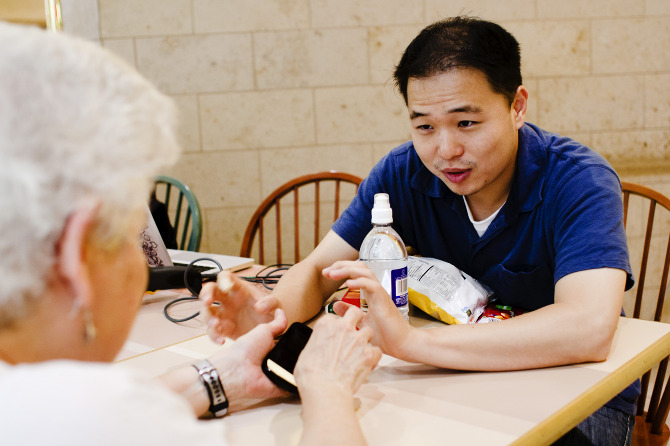
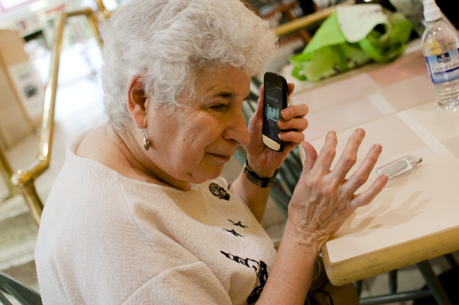
We conducted contextual inquiry of the shopping, checkout, and payment process for nine visually impaired individuals (seven are completely blind, two are low-vision). We interviewed four more users remotely and talked to a number of local research experts and associates of organizations that work with the blind to develop a full understanding of the issues. Naturally, our clients were able to contribute their deep industry knowledge of financial and payment services.
We took time to get to know each of our participants to understand each of their needs and attitudes.
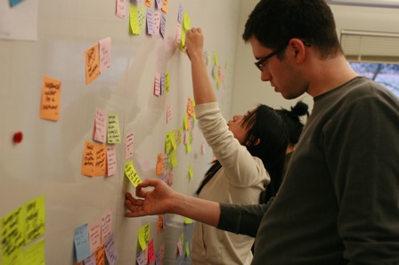
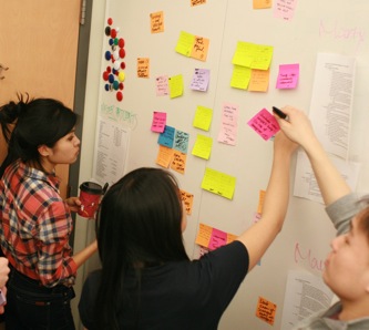
Synthesis
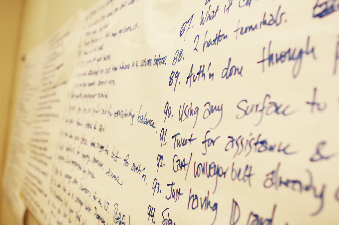
During an extensive synthesis process, we gathered our notes and ideas on post-its and spent our time hanging out at our white board, working in groups, splitting up, conversing, sharing out thoughts and digging down into the data and identifying opportunity areas for design.
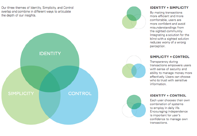
We sifted through all of our data and determined the greatest needs of our users and provide design direction for future ideation. We developed an understanding of the design space by articulating a framework of the shopping process which we used as a tool to focus the final form of the design.
Ideation
Through brainstorming, bodystorming, sketching, and prototyping we explored technological and non-technological solutions.
We were instructed to plan our technology for “3-5 years out,” so we wanted to take advantage of diverse solutions possible. Rather than focusing on the narrow task of transactions, we developed wildly divergent ideas for a broad vision of the ideal experience for our visually impaired users. Examples of these explorations are as follows
- Form: wrist, eyewear, handheld devices
- Technology: Speech recognition, image processing, wayfinding, binaural sound
- Interaction: proprioception, motion gestures, touchscreen gestures, audio feedback
We evaluated our ideas by sharing physical device mockups with users to understand the interactions and learned critical lessons for the different levels of technology we could develop. We quickly understood the feasibility and acceptability of the diverse concepts embedded in each idea while developing empathy for our participants perspective on technology.
From continued competitive analysis and follow-up interviews, we brought our attention back to the transaction and payment space to build a solution. We determined the best opportunity to make a difference would be to develop an interface from the ground up.
NFC (near-field communication technology) was growing in adoption and by all accounts expected to be commonplace in the future. However, upon evaluating the technology in this context with the latest Nexus phone, we found the interactions frustrating to sighted users and particularly aggravating to our visually impaired participants. In short, the antenna range was too short to expect a reliable connection; Not a useful choice when a trustworthy interaction is an important requirement for our users’ peace of mind.
If we could develop a solution that is accessible, we have a chance to make sure that new infrastructures can be built with accessibility in mind.
Prototyping
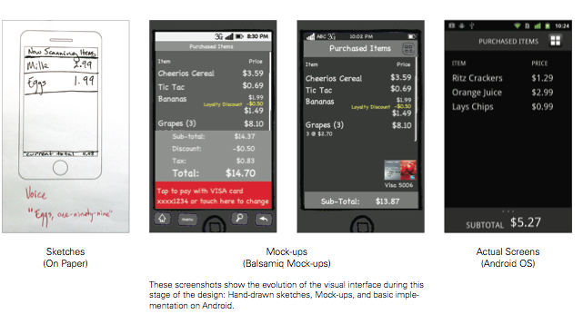
Our end-goal was to show a vision for a future product 3-5 years out, so we have applied our knowledge of the resources and design space to develop multiple ideas at once to determine the best interactions available in design. Our testing included mock-ups using lo-fidelity construction and wizard-of-Oz style simulation. Later on we moved to lo- and medium-fidelity mobile mock-ups coupled with interactions programmed to be able to simulate a real. For our final iteration, we intend to test in a real shopping environment. After four iteration cycles, our team presented our prototype and final report to the clients.
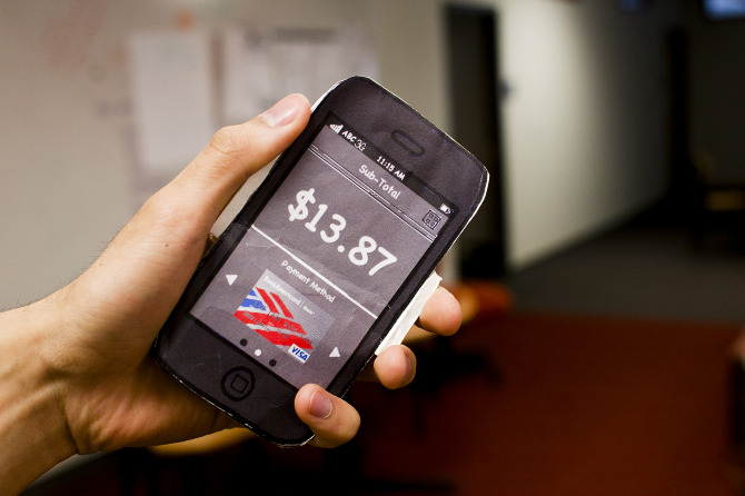
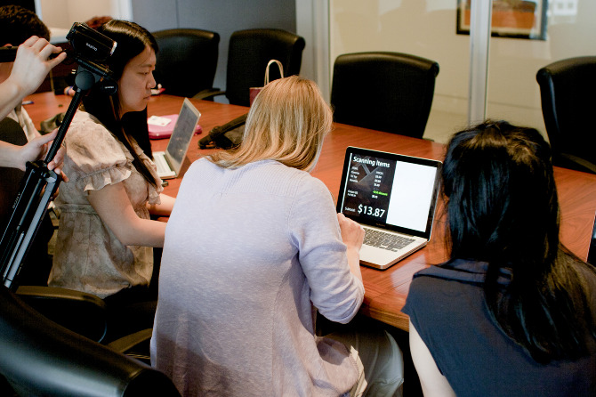
Our initial prototypes were split because we had two core experiences: visual and non-visual. Though our designs were cohesive from the beginning, we needed a coordinated effort to understand the multiple experiences. Our first prototypes were paper mockups with a foam-core frame for sighted users (pictured below) and a coded setup including a laptop, barcode scanner and phone running a very low-level version of the Android application. This latter setup provided an approximation of the experience for those who cannot see. Our latter versions were able to bring what we learned of the visual interface interactions and combine with the knowledge from the embodied interaction.

by James Mulholland, Jooyong Lee, Zhenshuo Fang, Brendan Kiu, and Nastasha Tan
Sponsored by Bank of America
Coursework for HCI Capstone Project
Masters of Human-Computer Interaction
Carnegie Mellon University, Spring 2011