geneHackman (No Relation)
 Featured on FlowingData on June 17, 2011
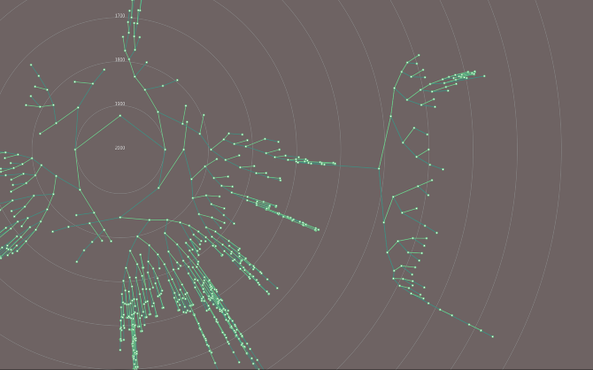
Created using Processing, geneHackman is a radial visualization for genealogical data. Individuals, represented as nodes, are placed a distance from the center relative to the year they were born, with 2000 at the center moving backward in time as they move outward. The paternal lines are traced in darker green; the maternal lines are traced in lighter green. The software reads common GEDCOM files to generate the relationships.
I started a Github Repo for collaborative development started here
Video Demo of Interaction:
Background
For my information visualization project I chose to dive into my own family tree. The data comes from a file assembled by an estranged aunt (whom I’ve never met). She had converted to the Mormon church which has a strong mission of researching family lineage.
Using JGenealogy I could export a .KML document to view the geographical distribution by generation. Mildly interesting, but the map search was a little inaccurate. The geography data available pointed to England mostly as well as northern Europe and a couple different areas in the US (especially midwest and east coast). In JGeneaology and GEDitCOM II, I was able to view the data and browse and edit. But with so many people, I couldn’t view them all at once and still get an idea of the information.
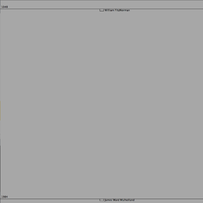
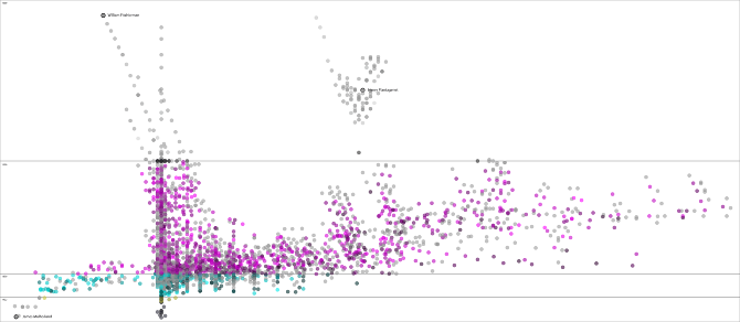
I knew previously that going back far enough I could trace my line to Henry Plantagenet (Henry II of England, ruled 1154–1189AD). The fact itself is pretty exciting so I wanted to see that relationship. William FitzNorman (of the Normandy de la Mere clan, b1048) is the oldest on my tree. However since he was a descendant of Rollo the Viking (Duke of Normandy) there are records that go back much further… perhaps even to Fjornjot “the Wind” of Finnish folklore (b 120 AD)… !?
Since my family intends to expand and enhance the data over time, this project could be used as a tool for identifying a browsing through parts of the data. Now unfortunately, this information is just what is known from my grandpa’s side of the family. I don’t have very extensive information on the other branches of ancestry, yet.
I used to think I was almost completely Irish and German. But it’s an odd feeling looking back so far where the English and Scandinavian and French all blend together. Can this composition be quantified like on the NY Times site? Perhaps that’s on tap for the next round.
There are few resources to render family heritage in traditional tree structures. GEDCOM is a common program to manage genealogy data. There are a few others that offer to render the family tree (even in 3D), but no software currently shows the entire tree in a way that allows a full view of the family over the entire 1000 year span.
Process
Creating the Database
Using Processing I parsed a GEDCOM genealogy file, organized the data using a hashmap, and generated the tree structure using recursion. In Processing, rolling over an individual reveals the name and birth-year.
About the Data:
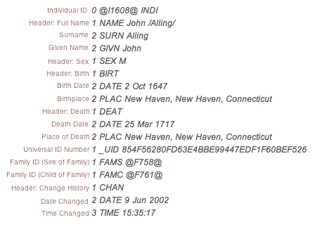
The data is in a common genealogy GEDCOM format used by genealogy software. There are almost 80000 lines in the file, between 12-18 lines per entry for nearly 4900 entries. Below is an example:
Working with Data
The dataset itself caused me the most grief because there were many behaviors of the software and characteristics of the data that I didn’t realize until much later. Some entries included date of birth, some included date of death. I also made an 11th hour realization that some parents were parents of more than one family, so some of the relationships are not drawn as extensively as they should be at first.
After parsing, I set up a HashMap to store all of the family ID numbers and then drew the tree using recursion. Given that I had no previous experience with parsing or hashmaps, I was pleased to have been able to utilize them in this project. Recursion, the use of repeating a particular calculating, was also new to me, but I gained some experience understanding how to avoid too much recursion (it could crash if you’re not careful).
Prototyping the Visualization
During the initial graphic development I had to work out the shape of the graphics at the same time I was double checking the parsing of the data, making sure that all the data was combed through properly.
Process sketches:
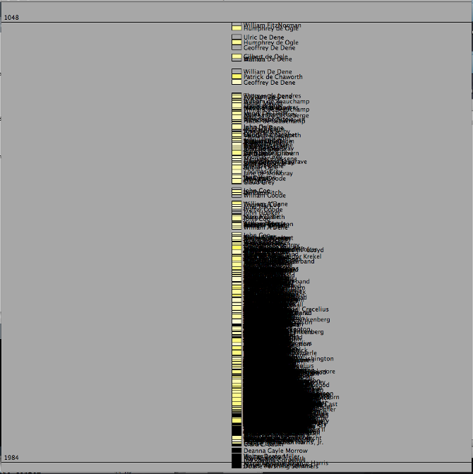
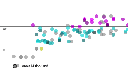
Hoping to add insight about family longevity, the areas of color represent four major eras in European history with different life-expectancies, with the specific color chosen at this stage purely for contrast. The saturation of the color relates how long each person lived. Persons depicted in gray do not have enough data to determine lifespan. Individuals are placed on the y-axis according to their birth-date. For those without a birth-date, I had to crudely estimate the date based on family relations (example: son without birthdate is presumed 30 years younger than his father).
Once parsing the data, the code takes another pass at each person and calculates age from birth- and death-dates or estimates the age if one is not already calculated.
Lessons
From the initial programming and working through the database issues, I gained insight into how to design the system further. The current version is step in this direction.
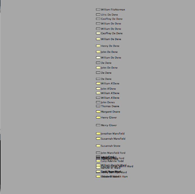
I had to restrict the focus of the descendants. Accounting for siblings in a two-dimensional system was overkill and reducing the complexity would go a long way towards relieving confusion.
- Being able to see a varying amount of data in a single view was useful and critical in examining the data. But being able to focus on the people themselves was going to make the interaction more meaningful.
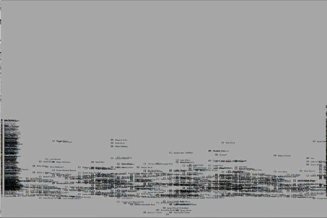
- The tree diagram concept is flawed because the more people you have at higher levels, the further apart they need to be. More people in the same generation requires ever more space when traveling back in time.
Interaction Development
Though I had successfully plotted the data, it needed to be presented in a form that allowed for easier exploration of the data and tools to show relationships more effectively.
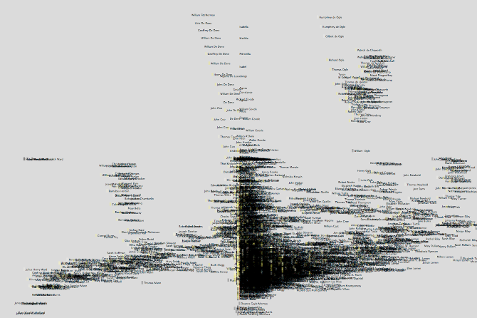
To solve these issues, I started developing the radial form which can accommodate the exponential records much more effectively. I decided to focus on my own story, and remove the siblings and their relations to avoid clutter.
Conceptually, my original had a problem as well. the up/down tree structure just couldn’t work at the level I wanted it to, even after I drew only the main lines, skipping the siblings (at least for now). To be able to understand the family network a little better, I developed the circle rendering to view the entire lineage cleanly and all at once.
The divided circle angles were inspired by personal family tree images from poster companies.
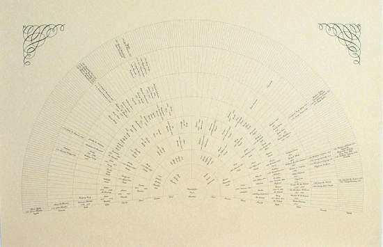
However, since my rendering accounts for specific birth-year the information shown in my prototype is more dense than the example above.
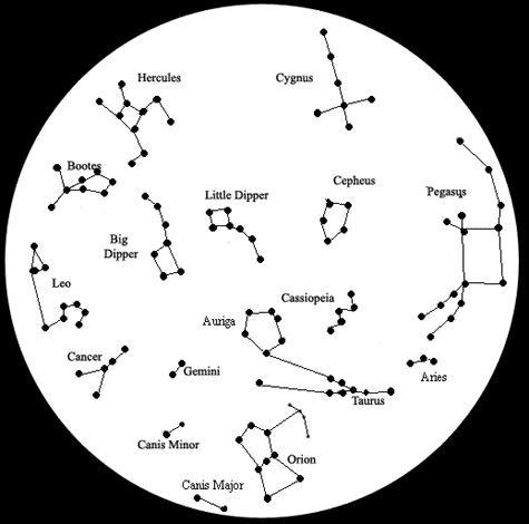
Graphically, I found inspiration in star-finder maps used to identify constellations:
I drew a few concepts and toyed with the idea of a combination ‘tumbler’ that would help trace specific relations, but there wasn’t enough time to program this experience. This direction might still work, so I am hoping it comes out in the next step. So I settled on a static radial diagram for now.
The primary challenge of drawing the relationships is to show each connection, without letting the connections overlap each other. Overlapping paths cause confusion and prevent the user from seeing true relationships. To make sure there were no overlaps, I calculated the angle of spread for each person by dividing the angle of the child by two. The calculation relies on knowing the number of generations from the person in the center. The angle calculation looks like this: Angle = 180/(2^(GEN-1))
So the strength of this is that it is mathematically impossible for one child-parent relationship line to cross with another (but does not account for incest which would provide a crossover.
Caveats
However there is an obvious problem: by the time you get more than 7 or 8 generations out, the density on screen becomes too intense to understand what is going on. As you zoom in you start to understand what is going on.
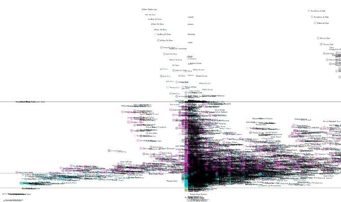
The current interaction, as shown in the video, clicking on each person will make the older portions of the tree spread out as if they were newer allowing for greater focus on a distant relation. The mechanism of clicking is not useful, and it should not be needed in a final version, but the change of focus was a very useful function to understand ancient relations, which to me were the most interesting.
After diving back into the parsing code, I still found few errors that prevented many key people from showing up. It was helpful to make sure the system could accommodate other exceptions yet unknown. In the new version I accounted for longer data entries so that a full person is created.
Interaction Details
Currently the viewing controls are crude, but they were reliable for prototyping. They enable exploration of the diagram for a designer to proof.
Current Controls:
z– zoom outx– zoom in0– re-center on middle← ↑ → ↓ arrows– pan around with smooth acceleration
Future user interface components to explore could include callouts for deeper display of currently selected person. Further study of genealogical tracking software and users would be useful to determine the best context for which to design any new features.
Conclusions
Like many coding projects I spent hours going down rabbit holes that didn’t get me anywhere. I feel the efforts paid off though and the key features to navigate and understand the diagram are in place. A handful of bugs regarding color rendering are still in place and hope to fix them soon. The code does work on other GEDCOM files, but takes some tweaking. The code is customized for my own dataset, but down the line I hope to have plug-in-play capability with other data files.
Unfortunately, there are still problems in the data itself (I believe there are multiples of one person linked as a father to himself!) but the nice thing is that my navigation makes these errors apparent.
I would like to add more functionality soon including extra controls via controlP5 library to adjust parameters more easily. A filter-like search feature would be interesting but requires broader reflection on the overall functionality and interaction.
Future versions could allow more accurate zooming and more sophisticated line drawing using bezier curves (my first attempts were way off!). Since there are a couple historic figures in the tree, it might be nice to pull from wikipedia if data is available.
by James Mulholland
Coursework for Interactive Art and Computational Design
Instructor/mentor: Golan Levin
Masters of Human-Computer Interaction
Carnegie Mellon University, Spring 2011